Traders help traders! On this page, we would like to share our thoughts about trading with you, as well as discuss a few commonly asked questions from our visitors and customers. If you have any comments, or any (nice and positive) thoughts that you would like to share, please email them to us. We will be happy to post them on this page.
The articles below were written prior to the change on October 4th. Everything still stands, except we no longer trade the 133T chart. The 133T chart, after the change, looks like a 50-tick chart, which is way too small to trade! Thank you for your attention! (See bottom of this page for an explanation.)
- What is the BEST time frame for day trading?
Many have asked this question, “what is the best time frame for day trading?” Before we answer that, let’s examine the pros and cons of a higher time frame and a lower time frame.
A lower (faster) time frame will give you more trading opportunities. Your risk (initial stop) will be smaller since the range of each bar is relatively small. You will not feel bored because the setups will occur quickly one after another. The risk is, of course, with more signals, you might be over trading. The chart might be more “noisy”, and you might be getting a few false moves along the way. Because the chart moves faster, you are also forced to make quick decisions and won’t have much time to think before pulling the trigger.
A higher (slower) time frame offers less trading setups, along with less false signals. The range of each bar will be relatively larger, so is your risk (initial stop). When the market is relatively quiet, you may not be able to find an optimal entry signal, which is not necessarily a bad thing, but you do need to have the discipline to sit on your hands when this occurs. Because it takes more time to form a bar, it grants you more time to make trading decisions.
What time frame should you be trading with? It is the one question I am asked on a weekly basis. I really can’t tell you that. Only you can answer that question for yourself. Each person has different personalities. What works for me might not work for you. The most important thing is to find a time frame that fits YOUR trading style and personality. It’s all about your personality, trading style, risk tolerance and the goal you want to achieve. Just like some who can’t sleep at night if he has an open position in the market, others think getting in and out of the market every 5 seconds is ridiculous. So the only “criteria” I can suggest is to find what you are “comfortable” with. You must find your own comfort zone. It is important that you feel comfortable with the time frame of your choice, so you can easily flow into the “zone” and breathe with the market. You have to find a chart that moves at a “speed” that you can handle, and an initial risk that you can tolerate. It’s the balance of the two you are seeking.
There are many 133-tick charts of the S&P500 emini Futures (ES) posted on this website. That’s the lower time frame chart we mainly take signals from (prior to October 4th, 2009. We have changed our smallest time frame to 377 tick on ES since. See bottom of this page for an explanation.) But we do have several workspaces saved for the same market, ranging from 35-tick (especially for very slow market condition, or when trading overnight session), to 987-tick charts (to find the overall trend, to see what the market has been doing at a glance, to find out where we are “here and now” in relation to a trend). 233-tick chart is a good confirmation, while 510-tick chart is a good “anchor chart”. These are our setups. You are welcome to do what we do. But if you are not comfortable with this setting, by all means find your own. It’s like, I am sure there are very successful traders, who trade off a daily chart and use a weekly chart as an anchor, but since I don’t feel comfortable with the risk I will be taking, the time it takes for a trade to mature, the greater uncertainty I will be tolerating, I simply won’t trade it this way. The only way I can trade a higher time frame like the daily chart is my Tent Trading method, which is a monthly income trade strategy with very low risk.
However, I will say this: “Time” is artificial. It does not mean much in trading unless you have a “predictive” system that can project approximate time when the market might be reversing. Even that, it still does not mean much when it comes to chart the market. Tick charts provide more detailed information on the market’s movements. It often gives you more “rounded” tops and bottoms as well. When the market moves faster, you will have more bars. When the market is slow, you get less bars. Time is irrelavant here. Share bar chart or volume chart have similar effect and are superior than any time based chart in my humble opinion. (Now in 2023, I have placed a 1-minute chart side by side with my tick charts, and like what I see.)
One example I like to use is this: Say the market is in a down trend on a 5-minute chart. At the close of a bar, you find yourself looking at a “hammer” candle, with the open price very close to the close price near the high of the bar, and a down wick that’s 5 points long. You check other indicators and conclude that this is a sign of reversal. You enter a long position at the open of the next bar. In this case, your stop, ideally, would be 5+ points. The same scenario on a tick chart, within that same 5 minutes, I might be getting 20, 30, 50, or even 100 bars, depending on what tick count I use, and I will get a clear picture that the market is moving down, finding the bottom, and reversing. I could enter that long position near the low of the 5-minute candle wick. This means my initial risk (stop) will be smaller, and my reward will be greater. What’s in your stop is now my gain. When you enter the trade on the 5-minute chart in this case, I might have an open profit of 4 points and my stop already at breakeven or better.
The advantage of having a time based chart is that it forms more traditional candlesticks and patterns: hammer, doji, shooting stars, engulfing, etc. It is a good confirmation, but probably not a very good chart to base it on for entering the market in a timely manner. The best way, of course, is to combine these two worlds. Find an entry signal on the lower time frame chart, then manage your position together with the higher time frame chart to locate the optimal timing to enter and exit the market. If I am traveling to LA from Chicago, the lower time frame chart is like a local map, which leads me to get out of the city and find the highway (entry). The next higher time frame is like a regional map, it tells me what interstate I will be connecting to, where I can find places to rest and where I should pay tolls (scaling in/out, money management). The highest time frame is like a national map, it gives me the general direction, telling me I should be heading west instead of east, how far I have been traveling, and how far it is from my destination (direction of the trend, where I am “here and now” in relation to the “big picture”). Once I am approaching my destination, I switch to a local map again, to find the best exit to get out of the highway and enter the city (exit).
Personally I am not a big fan of Renko and Range bar charts. One reason is that my indicators already have the smooth mechanism built in. I don’t need a time frame to further smooth the price action which will slow down and delay my signals. Also, if you have a fixed range or Renko chart, which means you can never enter on the bar that is lowest in a directional change, which means your stop will be at least the size of your range or Renko, possibly twice that. This is too big of a stop for my taste.
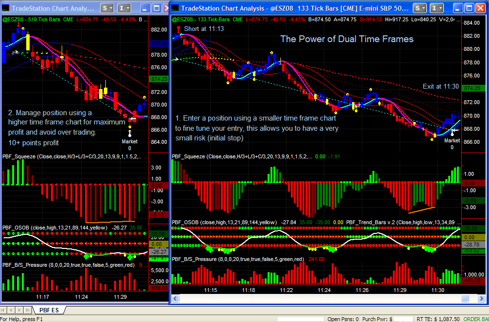
The chart below illustrates this idea. On the right hand side, we have a 133-tick chart. At 11:13, we entered a short on the weakening momentum on the Squeeze, with OSOB peaking and the buying pressure on Buy Sell Pressure easing. Notice that at the same time, there was no valid signal on the 510-tick chart yet. The PaintBar and the short term Trend Bar then turned red on the 133-tick chart and the price proceeded to break below the moving averages and the iTunnel. Now we look at the 510-tick chart to manage our position. The first rally back to the EMAs and retest this level is the scariest. Luckily for us, it held. While we had blue paint bars and cyan FMA on the 133-tick chart, there was no sign of reversal on the 510-tick chart. The market then bounced off the EMAs on both charts and continued to go down. We can move our stop to 880 at this point. The market retested the EMAs once again at 11:28, almost touched it but not really: a sign of weakness. The short position still looked good on the 510-tick chart. We continue to hold this position. Now, why did we exit this position where we got out? After 3 “waves” down (or 5, depending on how you look at it), we saw a divergence on the Squeeze. Sure, we had another divergence (or two) at 11:23 as well, the difference is, this time, the Squeeze on the 510-tick chart had a slight higher low when the price made a new low, we anticipated that there will be a divergence on the 510-tick chart as well. The OSOB also showed oversold condition on both charts, and the selling pressure peaked on the 510T, with buying pressure coming in on the 133-tick chart.
Using dual time frames, we are able to hold the position longer when a trend occurs for a greater gain, and avoid over trading.
Hope this helps.
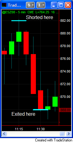
Below is a 5-minute chart that shows the same time period as the above trade. It is probably impossible for anyone to have the same entry and exit as the tick charts above if this 5-minute chart was used to make trading decisions.
- How to determine what time frame to trade?
Many have asked for suggestions on a time frame to trade. In our humble opinion, selecting the “right” time frame to fit your trading style is one of the keys to be successful in this business. When trading the US Futures market, under “normal” market conditions, we like to take signals from a 133 tick chart for the ES (See bottom of this page for an explanation), meanwhile watching two higher time frames in the ratio of 1:4:8 approximately. No particular reason, we just found this ratio worked well for us from our past experiences. So for the ES, we watch 133T, 510T and 987T at the same time. Because the other 3 markets have lower volume, our signal chart would be 89 tick for YM, NQ and ER2.
This is, however, merely what we do and what we find comfortable with. It is not a recommendation, and there is no “best” time frame to fit every one. It really depends on your trading style and risk tolerance. Most customers, when they first came to us, found the 133 tick chart to be extremely fast and nearly impossible to trade. Half of them would try and go back to what they used to trade with, the other half would try harder and eventually get used to it. The funny thing is, after the extreme volatility during the last quarter of 2008, came the beginning of 2009, many of these customer have actually reported that they felt the 133 tick chart was too slow!
A lower (smaller tick count) time frame chart allows us to enter the market with a relatively smaller risk (initial stop), but one might get out of a winning trade too soon. Higher time frame might give us greater profit if a trend develops and you are able to hold your position, but the initial stop might be greater. The solution is to combine the best of both worlds as discuessed above.
So how do you determine what time frame to use for your trading? One way to find out is through back testing and find the best risk/reward ratio that you feel comfortable with. Pull out a chart and plot the indicators on it. Find the entries and logical exits, mark them on the chart. Then calculate the average risk/reward ratio for that time frame. If risk control is what you emphasize more, and by the time the system generates an entry signal, the initial stop is too big for your taste on average, then try a smaller tick count. Do so until you find one that you feel comfortable with on most setups. We don’t recommend anything smaller than 133 tick for ES and 89 tick for the other 3, though when day trading the forex markets, we like to use 35 tick chart for signals. For all the other markets or individual stock symbols, back test until you find a time frame with a risk/reward ratio which is favorable for you.
We have all heard the cliche: “Cut your losers short and let your winners run”. Money management plays an extremely important role in trading and it’s vital to our success. While most people focus on taking less risk, from the experiences with our customers, some can bite the bullet and cut their losers short, unfortunately, not many can hold their winners and make 5, 8, or 10+ points per trade. While trading can be discretionary, we have to have firm money management rules and should never violate them under any circumstances. Trade to trade well, not to make money, and money will follow. If you follow your money management rules and lose money, reward yourself with a pint of Haagen-Dazs! But if you are often stopped out and find the market reverses on you to go in your direction, you need to reconsider the time frame you trade with, or the placement of the stop.
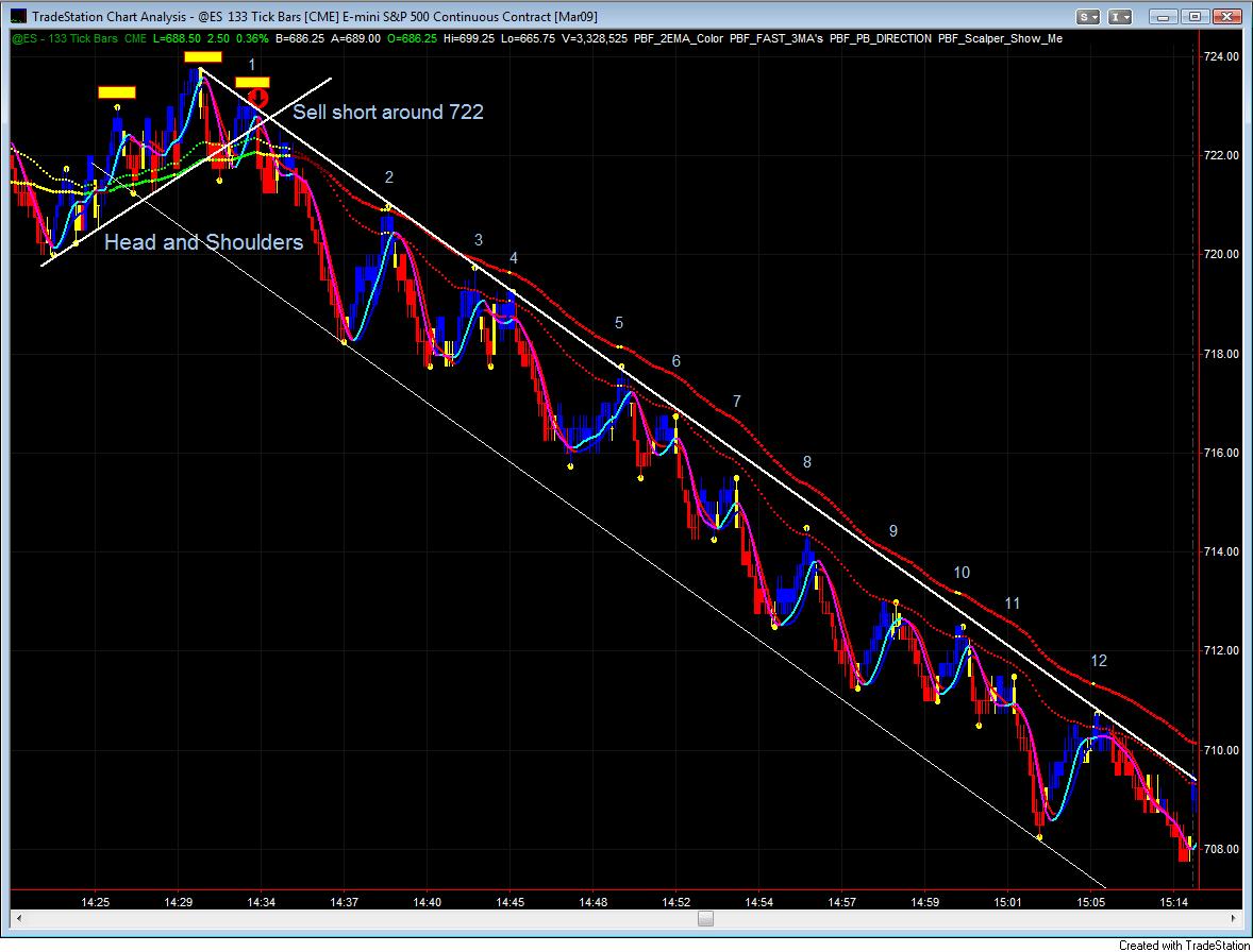
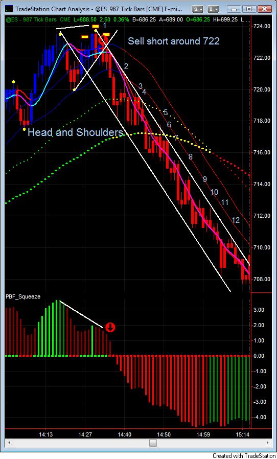
One size doesn’t always fits all in trading! The market either goes up, down, or sideways. When the market is choppy, meaning if the price trades within a small range (say, 2-3 points) for an extended period of time, it is difficult to make money, we should stay away. If each “leg” is relatively big, it’s easier for us to scalp or follow the trend. It is not unusual, however, to see the market moves in one direction ever so slowly, without strong momentum but stubbornly, goes up 3 points then pulls back 2, up another 2 points and down another point, then up another 2.5 yet correct itself for another 1.5 again, what we call “grinding”. The market is choppy but not moving sideways, it is still in favor of one direction over the other. Look at the charts below, the market was grinding down. On the 133 tick chart, assuming you sold short around 722 on the right shoulder of the Head and Shoulder formation (lower high), the market only went 2 ticks against you in this case. If you make your trading decision solely on the 133 tick chart, you might have exited at 719 for 3 points profit. If you have quick fingers, you could sell short again around 720 for a point or two. From hindsight, we see that you can short the last 45 minutes of trading 12 times and win most of the time if not all. I know I wouldn’t take 12 short trades in a row, that’s for sure. Assuming you did, and on average you made 1 point proft per trade, you have 12 points in the bank less the fee and commission, that leaves you roughly 10.75 points with a lot of stress and risk. Now look at the 987 tick chart below it. If you enter a short position based on it, your entry would be around 719, your stop would be 5 points in this case, and the market went against you almost immediately for about two points. However, the 987 tick chart suggested a downward move all the way till the market’s close at 708. If you were able to hold onto the winner, this would be an 11-point winner with only one trade. What if we combine the two charts? If we enter a short position at 722, take partial profit at 719, move the stop to breakeven to protect ourselves, as long as the 987 tick chart does not show a sign of a strength, we trail the stops down to 1 tick above the yellow scalper dots. Luckily, the market had a series of lower highs, we move our stops down 11 times, and we would have caught most of the entire move from 722 to 708.
Certainly, this doesn’t happen every day. But if you look at the “big picture”, how many times does the market change its trend on average per day? Certainly not 30-40 times. While taking signals from a small tick chart allows us to minimize our risks, learn to let the winners run is equally as important. ACTIVELY cut your losers short, but don’t INTERFERE with your winners too much, just manage your position and trail your stop until you see a sign of reversal. Know which chart to look at in different market conditions. Learn to read the price action, select your time frame wisely.
Hope this helps.
ATTENTION Traders: On October 4th, 2009, the CME Group enhanced the reporting of trades to provide more information at a much faster speed. The once bundled information is now unbundled. What does this mean and how does it affect your trading? The effect of this upgrade is that it produces more ticks data over the same price action than were produced before. Since now the average tick count after this enhancement is about 2.5 times greater than before, we recommend that whatever tick chart you trade with before 10/04/2009, switch to a time frame that’s about 2.5 times higher. For example, most of of charting examples on the website created before 10/4/2009 were on 133 tick charts, that used to be our main chart to trade on ES. We now switch to 377 tick chart as our Signal chart, (133 x 2.5 = 332.5, 377 is the closest Fibonacci number). You may then use 987 tick chart or 1597 tick chart (also Fib numbers) as your “anchor” chart. This only affects Index Futures from CME (ES, YM, NQ). If you trade other markets such as Russell, Gold, Oil, this change does not affect you.